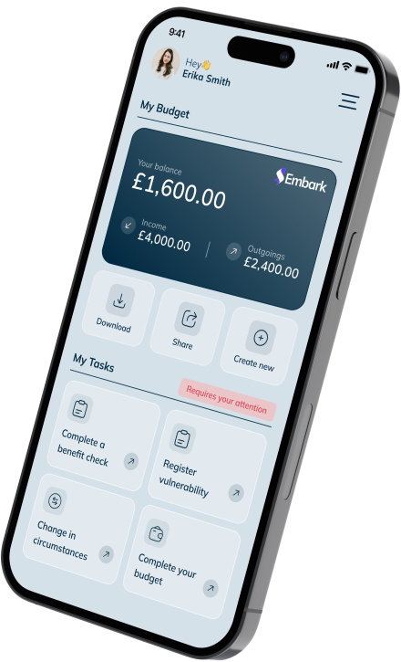
Completing the income and expenditure (I&E) journey is a core part of our Embark service. Through Open Banking and access to CRA data, as well as supported integration with free debt advice provider PayPlan, benefits calculator provider InBest and price comparison website ismybillfair.com, Embark acts as a central hub to support customers through the cost-of-living crisis and beyond.
As the UK’s most experienced provider of customer affordability software and with many of our features coming after the I&E journey, it’s important that we provide an accessible, easy-to-follow and engaging process. By enhancing the user experience, we’ve been able to help thousands of customers access free debt advice via Embark every month.
Here, Product Designer, Dylan Perry, walks us through some of the ways we retain customer focus by using CTAs (call to actions) after completing the Embark journey…
Use strong personalised commands
It’s important to be clear and concise with each CTA. You don’t have a lot of space to work with to get your point across. Using strong, personalised commands is the right route to take. You need to start your CTA title with a question or a statement to get the user’s attention on an emotional level. Secondly, your CTA button is what you want the user’s desired action to be. For example, we want our users to benefit from free debt advice, so we’ve efficiently named our button ‘Get free debt help’.
Use content that provokes emotion and enthusiasm
We aim to elicit a strong response from our users as a result of their enthusiasm. If our CTA is enthusiastic then our users will be enthused to click the CTA. Our CTA button reading ‘Get free debt help’ not only provides the user with a beneficial solution but it also comes at no cost thanks to our partnership with PayPlan.
Give users a reason to take the desired action
The user is looking for something they can benefit from. Will the CTA help them manage their finances, get a better deal, or save money? This is the unique selling point and is arguably one of the most important things to get users to follow the desired CTA.
Understand your devices
Initially creating the CTAs based on the most-used device is a must as different devices (phone, tablet, desktop) have different user behaviours. For example, users most commonly scroll and tap on their phones with their thumbs. Using that to our advantage, we’ve created a custom-sized button that makes it easier for a user to click without having to re-adjust their scrolling.
Hosting a ‘Call us’ button for our mobile users has been key to simplifying their respective journeys and has helped users quickly contact their lender or speak to PayPlan. On the other hand, through our data, we’ve found displaying a ‘Call us’ button on a desktop can be somewhat confusing for users as a lot of desktop devices do not have call functionality. To combat this, we’ve highlighted the relevant number to ensure the process is more beneficial for the user.
Make it stand out!
Remember, a CTA is something that you want a user to do, and it must stand out! It needs to encourage the user to click it. Icons are a great way to grab the user’s attention, along with a bright, bold CTA button. Keeping the character count of your CTA description (if applicable) is also key as users tend to look for keywords within paragraphs, so you should eliminate them from having to do that by aiming for no more than 35 characters.
Ultimately, it’s about making the customer’s journey as easy as possible and delivering the information they need in the most accessible way.
To learn more about Embark, contact us or visit paylinksolutions.co.uk.


