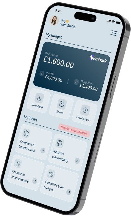
At Paylink, we’ve embarked on a journey to make our application more inclusive and welcoming to everyone through a test-driven approach to accessibility. In this blog, we share our experiences and strategies to create a more accessible application.
Understanding Accessibility Guidelines
We’ve made it a priority to educate ourselves and understand best practice when it comes to accessibility guidelines by using online resources and documentation, such as the Web Content Accessibility Guidelines (WCAG).
The WCAG guidelines provided a solid foundation for understanding accessibility principles and how to apply them in the design and development of Embark and our other products and applications. We’ve also worked in collaboration with some of our clients to provide a more accessible application.
Accessibility Testing Tools
To conduct comprehensive accessibility testing, we leveraged open-source accessibility testing tools available on the market. These tools automated various aspects of accessibility testing, allowing us to identify potential issues quickly. Some of the tools we used included:
- Lighthouse: This browser extension provided valuable insights into accessibility, performance, and other aspects of our application.
- Wave Accessibility Extension: This tool highlighted accessibility errors and suggested possible solutions directly within our browser.
- Nonvisual Desktop Access: We used this screen reader to simulate the experience of users with visual impairments.
- Colour Contrast Analysis: Online tools helped us check and adjust colour contrast to meet WCAG standards.
Incorporating Manual Testing
While automated tools were beneficial, we understood the importance of manual testing to gain a deeper understanding of the user experience. Manual testing allowed us to immerse ourselves in several ways ensuring different approaches and options could be used. We followed specific test scenarios to ensure all features were accessible, including keyboard navigation, focus management, and compatibility with screen readers.
Documenting and Prioritising Issues
Tracking and documenting accessibility issues was vital to the success of our journey. We created tasks and bugs in two different ways.
- Any items which required fundamental redesign were raised as tasks rather than bugs so they could be supported by the business teams and design/UX.
- Any items missing labels/tags or required changes in the code or content were raised as bugs.
We believe it has been an important step for us to see accessibility issues in the same way a bug might stop a feature from working in the way you are expecting. This has helped us to prioritise them and action them rather than it be something which is never picked up.
Continuous Learning
We’re still learning and implementing changes to improve our approach to accessibility at Paylink, and this is not limited to the way we test. Including accessibility and usability as part of the design step has improved our understanding of what accessibility means, ensuring any accessibility concerns are catered for before it reaches a development stage.
What’s next?
Our test-driven approach to accessibility has proved to be effective in making our application more inclusive. By leveraging available resources, accessibility testing tools, manual testing, and diverse testing perspectives, we were able to identify and address many accessibility issues.
However, our journey does not end here. We recognise that accessibility is an ongoing commitment, and we remain dedicated to continuous improvement. As we progress, we will continue to seek opportunities to expand our accessibility efforts, ensuring that our application remains a welcoming space for all users, regardless of their abilities.


